Find Here Responsive Web Design Actionable Tips and Tricks
The days were past us when the web developers used to design a static website only for the desktops. With the increase in technology, people now demand websites that can easily expand and shrink according to the device that we are using to access it. A responsive website is the newest trend in the town. In today’s time, approximately eighty percent of people use their mobile devices to access the Internet and surf different websites that they want. If you are also a website developer and are looking for ways to design responsive and dynamic websites, here are some of the tips and tricks that can easily help you out.

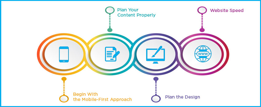
Begin With the Mobile-First Approach
The number of mobile Internet users has been increasing since the last couple of years, and it has now surpassed the number of people who use desktops. That us why you need to think and begin with the mobile-first approach whenever you think about developing the website. You can easily design the website that is acceptable and can be used by all screen sizes by making the website responsive. The mobile-friendly platform will allow the users to view the website and its content in a way that the users are comfortable in.
Plan Your Content Properly
Another important web development that the developers need to know about is to plan the content of the website in a proper manner. You need to make sure to design the website as well as the content in a manner that suits every screen size that the content will be visible on. You need to make sure that your content must be according to the audience that you are planning to target, and it must be set on the website in an attractive manner.
Plan the Design
Keeping your target audience product and website in mind, you need to create a design that will look good irrespective of the screen size. Come up with a flexible approach to fulfill the development task at hand. Use the flexible grids, media queries and other things that make sure that the resolution of the website is never compromised. There are various tools that you can use and easily find in order to design a responsive and dynamic website for your users.
Website Speed
Speed is going to play an extremely important role in deciding the user experience. It will also help in improving the rank of the website on any web browser. In case you are deciding on developing any website that will be supported by multiple devices, it is a must that you should focus on the speed and optimization of the website. Everything, including images, videos, text, grid, and navigation, must support in reducing the load time for the website. It is known that most of the viewers close the website in the initial few seconds if it does not load. That is why you need to pay the main focus on making the website fast, along with being responsive.
Contact Design Labz professional to know more.